


The Phone Case as a Modern Style Statement
Historically, functional items often transform into expressions of personal taste. The pocket watch, once a simple timekeeping tool, became a symbol of status and refinement. We see a similar evolution with the modern phone case. It is no longer just a protective shield but a high-rotation accessory that communicates your style narrative to the world. A well-chosen case can be the very detail that ties an entire outfit together, creating a look that feels deliberate and complete.
Think of it this way: a vibrant color can signal confidence, while a softer tone might reflect a more understated mood. This makes the phone case as a fashion accessory a powerful tool for self-expression. It’s an intentional choice, not an afterthought. The philosophy we built into our story is rooted in this belief, viewing each design as a core part of a personal brand. Your phone is with you constantly, making its case one of the most visible accessories you own. Why shouldn't it be as thoughtfully selected as your shoes or handbag?
Mastering Color Theory for Outfit Coordination
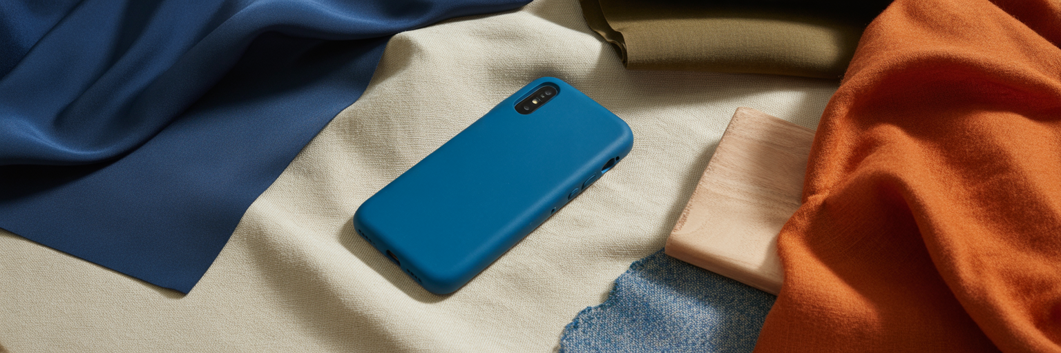
Understanding a few principles of iPhone case color coordination can make styling effortless. It’s less about strict rules and more about knowing what effect you want to create. You can approach this with a few core strategies. For a high-contrast look that makes a statement, choose complementary colors, which sit opposite each other on the color wheel, like a vibrant blue case paired with an orange dress. The tension between the two creates a dynamic visual pop.
If you prefer a more subtle and cohesive appearance, analogous colors are your best tool. These are neighbors on the color wheel, such as green and blue, and they produce a harmonious, blended effect. Another powerful technique is monochromatic styling, where your case perfectly matches your outfit's shade. This creates a seamless and polished silhouette. A slight variation is tonal styling, where the case is a slightly different shade of the same color, adding depth without breaking the unified look. Finally, there is the accent pop. This is where you use a brightly colored case as the single point of vibrancy in an otherwise neutral outfit, like a bold red case with an all-black ensemble. For this approach, a curated selection of our solid color options provides the perfect starting point.
| Strategy | Visual Effect | Best For |
|---|---|---|
| Complementary | High-contrast, dynamic | Making a bold statement |
| Analogous | Harmonious, cohesive | Subtle and sophisticated looks |
| Monochromatic | Seamless, polished | Creating a powerful, unified silhouette |
| Accent Pop | Striking, focused | Elevating neutral or minimalist outfits |
Note: This table summarizes foundational color theory principles to guide your accessory choices. The best strategy depends on the desired impact and occasion.
Aligning Your Case with Wardrobe Aesthetics
Beyond pure color theory, the most effective styling comes from aligning your case with your personal wardrobe aesthetic. This is how to style a vibrant phone case in a way that feels authentic to you. Instead of just matching colors, you are matching a mood and a lifestyle. The same case can look entirely different depending on the clothes it is paired with.
Consider how your case functions within different style contexts:
- For Professional Settings: Deep jewel tones like emerald or sapphire add personality without appearing unprofessional. A single, bold primary color can also project confidence and decisiveness. You can explore options from our work and study collection to find a suitable match.
- For Casual and Streetwear: This is where bright, graphic, and neon cases feel most at home. They naturally complement the expressive silhouettes of streetwear, denim, and sneakers, acting as an extension of the outfit's energy.
- For the Minimalist: A minimalist wardrobe of black, white, and grey creates the perfect canvas for a phone case to be the sole point of color. A vibrant case becomes a refined statement piece. As noted by designers at Yumeng Global Furniture, true style involves curating one's entire environment, and a well-chosen accessory can harmonize a look.
- For Romantic or Feminine Styles: Vibrant pastels such as coral, lavender, or mint green pair beautifully with soft fabrics, delicate textures, and floral prints, creating a cohesive and thoughtfully assembled look.
The Art of Matching Cases to Occasions

Just as you wouldn't wear sneakers to a black-tie gala, your phone case should also adapt to the occasion. The context of an event is a key factor when you match phone case to outfit. For formal events or evening wear, a case with a metallic finish or a deep, luxurious color can complement your attire. However, sometimes a more subdued case is the better choice, allowing a statement dress or intricate jewelry to remain the focal point. You can find inspiration in our collection for night out events designed with these moments in mind.
Seasonal coordination also plays a role in sophisticated styling. It’s a subtle nod to the environment that shows a high level of attention to detail.
- Spring/Summer: This is the time for brighter, warmer colors. Think turquoise, coral, and sunny yellow to mirror the energy of the season.
- Autumn/Winter: As the weather cools, switch to richer, deeper tones. Burgundy, forest green, and mustard yellow create a sense of warmth and luxury.
This leads to the idea of building a "case wardrobe." You don't need dozens, but a small, curated collection of three or four cases allows you to rotate them just like any other accessory. This ensures you always have the perfect option on hand, whether for a business meeting, a casual weekend, or a special occasion.
Beyond Color: Texture and Material Considerations
For truly advanced, luxury iPhone case styling, we must look beyond color to the tactile world of texture and material. The finish of a case creates a distinct impression. A matte finish, for example, offers a modern, understated feel that absorbs light, while a glossy finish reflects it, creating a bold and eye-catching look. A textured surface adds a layer of tactile depth that can make a simple color feel far more interesting and sophisticated.
Material harmony is another detail that separates a good outfit from a great one. Consider pairing a sleek silicone case with sporty or technical fabrics. A tactile finish like the one on our crocodile leather effect case, on the other hand, pairs beautifully with classic wools, cashmere, or tailored pieces, adding a touch of timeless elegance. The final touch is in the hardware. For a truly polished look, try to match the metallic accents on your case, such as the camera ring or buttons, with your jewelry, belt buckle, or handbag hardware. This small detail creates a sense of cohesion that ties everything together. Ultimately, selecting a phone case is an act of intentional accessorizing that completes your personal style narrative.


